
 On the heels of this week's lows, came some pretty unexpected highs. It's funny, they always say when a door closes, a window opens, and so it seemed with the discovery of a new-to-me blog that I can't believe I've lived this long without! Pugly Pixel now neatly nestled into my sidebar is the brain child of a massively creative chick by the name of Katrina, and let me tell you she is a force, to be sure! I accidentally stumbled upon her virtual presence by way of another fave brought to us by Victoria Smith, SF Girl By Bay - which, if you're not familiar, you must make yourself. I've lurked on Victoria's blog for ages now, and always find it a wealth of information, and am hopelessly in love with the gratuitous display of design heavy eye candy. Whenever I'm down, or find my creativity tapped out, I take a spin around her posts, because nothing kicks my imagination back into high gear like saturating my brain with interesting images, and she delivers, let me tell you. In fact, don't let me tell you -- Go! Click! See for yourself, you won't be disappointed.
But it was during my stroll through Pugly Pixel that I found this post for people tragically addicted to creating color palettes in need of a clever way to display them. Finding myself unable to resist the temptation, I had to snag this little freebie, and give it a whirl. In the spirit of Spring, here's what I've come up with:
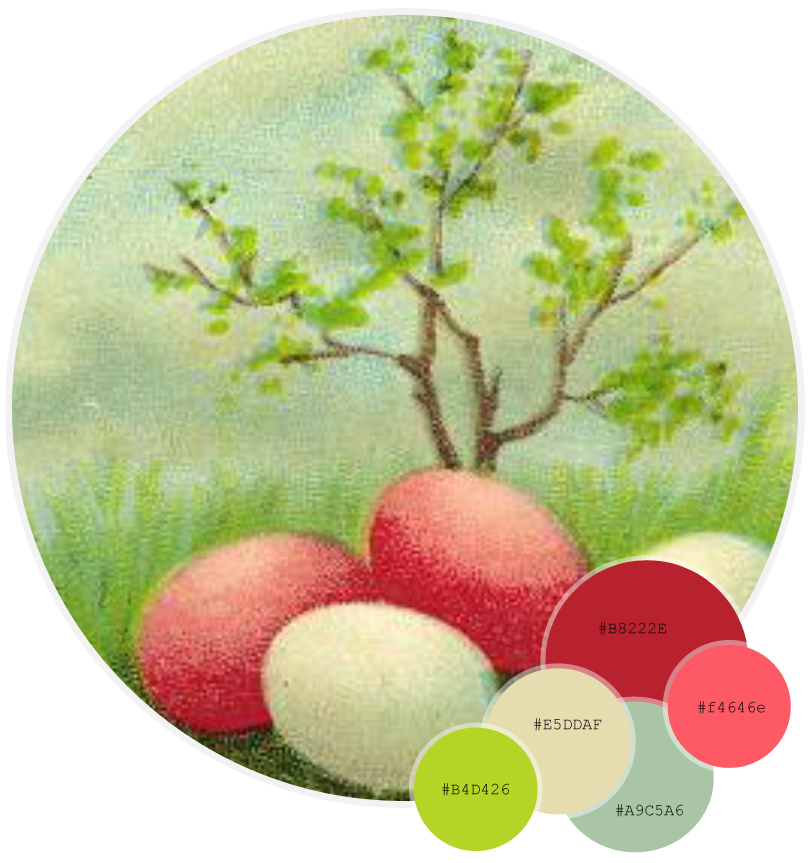 The gist of it is that you can insert your own picture into the largest circle, and then in Photoshop you
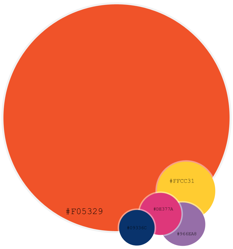 Another way I've used the template is by plugging in the colors of Pantone's Fashion Color Reports so they can be easily accessed, and close at hand when I need to reference them. I find pulling up jpegs (or png's in this case) a much quicker task than loading a 25 page, and upward PDF file. I've got an example of half of the Spring 2012 ladies' forecast. Apparel industry leaders (among others, i.e. interior design, and automotive to name a few) use the Pantone Color Reports, as well as others of their products to forecast, and predict popular colors for the upcoming seasons. Paying members receive their copy of the report in advance to plan ahead for their upcoming lines, and collections, however a free copy of the report is introduced to the public a bit later. The Fall 2012 Pantone Fashion Color Report was just released February 9th, kicking off Fashion Week. Your free copy of the report is available here.
If you're jonesing for your own Pugly Pixel color palette photo layout template, go grab one, and if you run into trouble trying to use it, cruise Katrina's tutorials, her corner of cyberspace is spilling with a wealth of knowledge. I'm so excited to have found this site, and even more so to be sharing it with you now. I know I'll be checking back in for her tips, and discoveries, and once you drink the kool-aid, I'm sure you will be too!